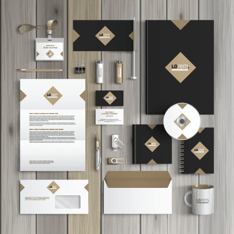
Designers love designing:
They make magic happen, don’t they?
It’s a very special set of skills that designers share with the world.
Designers often work across both digital and print media. While digital design focuses on creating engaging experiences for screens, print design demands a different approach to ensure clarity, color accuracy, and high-quality results. Here are five key considerations when designing for print and how it differs from digital design.
-
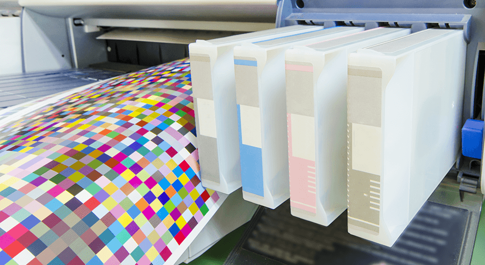
Designing Resolution and Image Quality
Print: High resolution is crucial for print materials. Images should be at least 300 DPI (dots per inch) to ensure crisp and clear output. Low-resolution images that look fine on a screen may appear pixelated or blurry when printed.
Digital: Screen resolutions vary, but standard web images are typically 72 DPI or 96 DPI. Since screens can scale images dynamically, designers don’t have to worry about resolution as much as in print.
-
Color Mode and Accuracy
Print: Print materials use the CMYK (Cyan, Magenta, Yellow, and Black) color model, which blends inks to create the final appearance. Designers must be mindful of color consistency and use Pantone colors when needed for accuracy.
Digital: Digital design relies on the RGB (Red, Green, Blue) color model, as screens emit light rather than reflecting it. Colors often appear more vibrant on screens but may look different when printed.
-
Typography and Readability
Print: Printed text needs to be highly legible, as there’s no way to adjust font sizes after printing. Serif fonts are often preferred for body text, as they improve readability on paper. Leading (line spacing) and kerning (letter spacing) must be carefully adjusted to prevent text from looking too tight or loose.
Digital: Digital text can be resized by the user, and sans-serif fonts are often more readable on screens. Designers must also consider how text will render on different screen sizes and resolutions.
-
Bleed and Safe Margins
Print: Print designs must include bleed (extra margin beyond the final cut size) to prevent unwanted white borders. Safe margins ensure that critical content isn’t cut off during trimming.
Digital: There’s no need for bleed in digital design. Instead, designers focus on responsive layouts that adapt to different screen sizes.
-
Interactivity and User Experience
Print: Print is a static medium, so designers use visual hierarchy, textures, and finishes to create impact. There’s no interactivity—once printed, it’s final.
Digital: Digital design includes interactive elements like hyperlinks, animations, and video. Designers must consider user engagement and navigation.
By understanding these key differences, designers can create stunning visuals tailored to each medium, ensuring optimal impact for both print and digital audiences.